

Web Design
11 Tips for Great Web Design
01. Have a plan
Having a well-thought-out plan is the cornerstone of successful web design. Before you start sketching layouts or selecting color palettes, take the time to define your website's purpose and objectives.
Consider your target audience and what you want them to achieve or experience on your site. A clear plan not only keeps your design process organized but also ensures that every element you incorporate serves a specific function.
Whether you're building a personal blog, an e-commerce platform, or a corporate website, a thoughtful plan sets the foundation for a user-friendly, visually appealing, and effective online presence. It guides your decisions throughout the design journey and helps you stay aligned with your brand identity and business goals.

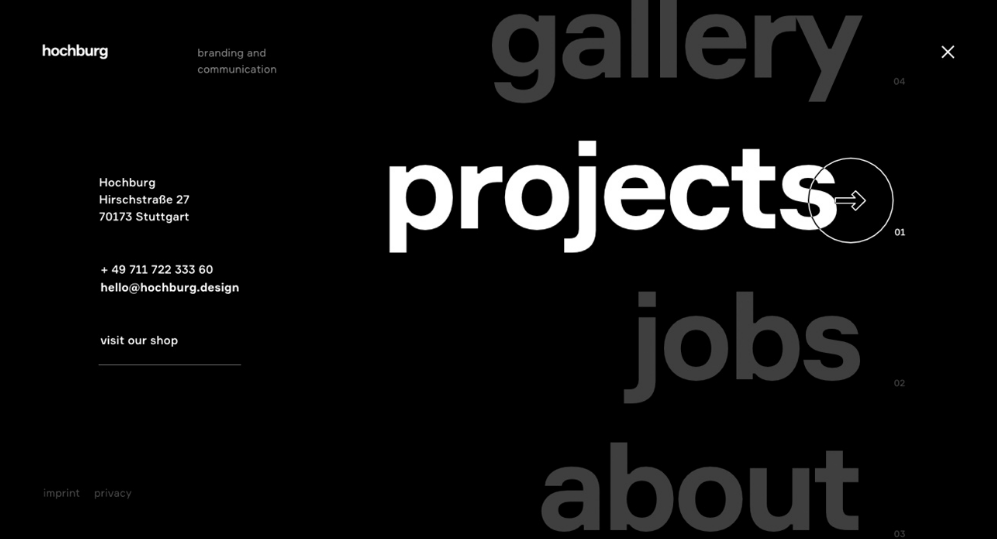
Website Types
Example of a Site Map

Awwwards.com
02. Pick a style
Picking the right style for your web design is akin to choosing the personality of your online presence. Your chosen style should not only reflect your brand identity but also resonate with your target audience. Whether it's a clean and minimalistic look for a modern edge, a rustic and textured style for a more traditional feel, or a vibrant and colorful design for a youthful and energetic appeal, the style you select sets the tone for your entire website. Each style has its unique characteristics, so it's essential to carefully consider which one aligns best with your objectives and audience to create a visually captivating and memorable digital experience.
-
![]()
Minimalistic
Clean lines, ample white space, and a focus on simplicity and functionality.
-
![]()
Flat Design
Simple, two-dimensional elements, often with bright colors and minimalistic icons.
-
![]()
Retro/Vintage
Incorporates design elements from past eras, creating a nostalgic feel.
-
![]()
Grungy
Utilizes rough textures, irregular shapes, and distressed visuals for a rugged appearance.
-
![]()
Illustrative
Features hand-drawn or illustrated elements that add a unique and artistic touch.
-
![]()
Corporate/Professional
Emphasizes a clean and professional look, often using subdued colors and clear typography.
-
![]()
Typography-Driven
Puts typography at the forefront, using creative fonts and text layouts for visual impact.
-
![]()
Photography-Centric
Focuses on high-quality, striking images as the main design element.
-
![]()
Skeuomorphic
Mimics real-world textures and objects, creating a tangible and familiar user experience.
-
![]()
Neumorphism
A recent trend featuring soft, subtle shadows and highlights for a tactile appearance.


03. Follow typography rules and styles
Typography is the unsung hero of web design, playing a pivotal role in shaping user experiences. It's not just about choosing beautiful fonts; it's about making them work harmoniously to ensure readability and visual appeal.
First and foremost, prioritize legibility by selecting fonts that are easy to read, especially in various sizes and on different screens.
Maintain consistency in font choices, sizes, and spacing throughout your website, using headings and subheadings to structure content and guide users.
Embrace contrast by pairing fonts with distinct styles, like pairing a sans-serif with a serif font, to create visual interest.
Ensure appropriate line spacing (leading), and avoid excessive use of decorative or novelty fonts that can distract from your message.
Lastly, pay attention to hierarchy and alignment to guide users' eyes through your content seamlessly.
In essence, mastering typography best practices enhances the overall readability and professionalism of your web design, leaving a lasting impression on your visitors.


04. Use grids
Grids are the bee’s knees of effective web design, providing a structured framework that not only enhances aesthetics but also improves user experience. By incorporating grids, you establish a sense of order and consistency across your website's layout. This organized structure aligns elements, such as text, images, and navigation menus, in a visually pleasing and predictable manner.
Whether you opt for a traditional grid or a more modern, asymmetrical grid, this fundamental design principle ensures that your website maintains a sense of balance, harmony, and professionalism, ultimately contributing to a positive user impression.

05. 60/30/10 Rule
The 60/30/10 rule is a golden ratio for creating a harmonious and visually appealing color palette in web design. This principle suggests that your color scheme should consist of 60% of a dominant or primary color, 30% of a secondary color that complements the primary one, and 10% of an accent color that adds vibrancy and highlights key elements. Adhering to this rule not only helps in maintaining a cohesive and balanced color scheme but also ensures that your website's design remains visually engaging without overwhelming the user's senses.

06. Chose one action color
Simplicity can be a powerful tool, and the concept of using one action color exemplifies this notion.
Selecting a single, distinct color to represent your primary call-to-action buttons or links is a strategic move. It not only draws immediate attention to those crucial elements but also reduces visual clutter and cognitive load for your users.
When a visitor encounters that lone, vibrant button amidst a sea of neutral tones, it acts as a visual cue, guiding them toward the desired action, whether it's making a purchase, signing up, or exploring more content. This one action color becomes a focal point that enhances user engagement and, ultimately, helps achieve your website's goals.
By keeping things simple and using color strategically, you can direct your audience's attention where it matters most, making for a more effective and enjoyable user experience.
07. White space is important
White space, often referred to as negative space, is a fundamental and often underestimated element in web design.
It's not merely the absence of content but a powerful tool that influences the overall user experience.
White space provides visual breathing room, allowing content and design elements to stand out and be more digestible. It aids in reducing clutter, improving readability, and directing the user's focus to key elements.
In web design, less can often mean more, and white space is the canvas upon which your content shines.

08. Use one font (or two)
In the realm of web typography, simplicity is key, and one of the golden rules is to use just one font (or at most, two) to maintain a cohesive and professional appearance. Selecting a well-crafted font that aligns with your brand's personality is essential.
When used consistently across your website, it not only helps build brand recognition but also enhances readability. The choice of a secondary font, if necessary, should complement the primary font in style and purpose.
Mixing fonts thoughtfully can create visual hierarchy and distinction between headings, subheadings, and body text. However, it's crucial to exercise restraint; too many fonts can lead to visual chaos and distract users from your content's message.
By adhering to this principle of using one or two fonts, you ensure a visually pleasing, harmonious, and user-friendly web design that leaves a positive impression on your audience.

09. Have a Style Guide
A style guide is the compass that keeps your web design journey on course.
It's a comprehensive reference point where all your design elements, including typography, colors, and branding, come together in perfect harmony.
This invaluable resource ensures consistency and cohesion throughout your website, providing both designers and developers with clear instructions on how to maintain your brand's visual identity.
A style guide is not just a practical tool; it's a reflection of your brand's professionalism and commitment to delivering a unified and memorable user experience.
Whether it's specifying font choices and sizes, defining color palettes, or detailing logo usage, a well-structured style guide is the roadmap to creating a visually appealing and cohesive online presence.
It empowers your team to work efficiently and ensures that your website communicates your brand's essence consistently and effectively to your audience.


10. When in doubt - Left Align
When faced with layout decisions in web design, a simple yet powerful rule to keep in mind is 'when in doubt, left-align.'
Left alignment is not only the default reading direction in many languages, but it also offers a sense of familiarity and ease for users as they navigate your content.
While there may be cases where center or right alignment is appropriate for specific design elements, adhering to left alignment as a general guideline provides a user-friendly foundation for effective web layouts, making your website content more accessible and engaging.


11. Don’t forget about mobile users - Short Paragraphs are the Key
In the age of mobile devices, optimizing your website for smaller screens is not just a good practice; it's imperative. Mobile users make up a significant portion of your audience, and their experience should never be an afterthought.
One effective strategy to cater to this audience is breaking your content into short paragraphs.
Remember, mobile users are often on the go, and their attention span is at a premium.
