

Personal Branding

HOW TO
DISCOVER YOUR UNIQUE COLOR PALETTE
This article for beginners is designed to help you understand colors & craft your own color palette like a PRO. YOU READY?
HEY SEXY
Get ready to feel FAB and shine as we take you on a journey of self-discovery and visual personal branding brilliance. This article, INTRO COURSE TO COLORS, is your ticket to revealing the secret to the most effective color palettes for personal brands. From uncovering the meanings behind colors and tips to crafting a breathtaking color palette, we'll provide the techniques to become the ultimate brand goddess/god. Whether you're a career queen or king, a creative genius, or simply seeking to add sparkle to your life, this is your START.

WHAT THE FLUFF IS A COLOR PALETTE?
Primary
Neutral
Minor
Secondary
(but first, a short recap.)
A VISUAL PERSONAL BRAND refers to the visual elements, such as logos, color palettes, and typography, that are associated with a person and used to present and promote their image, reputation, and unique qualities.
Accent
Have you ever noticed how specific colors can make you feel happy, calm, or energized? That's the magic of colors! And it's something that personal brands can harness to make their brand stand out and connect with their audience on a deeper level.
So, what exactly is a color palette? Well, think of it as a carefully selected set of colors that represent your personal brand. These colors will be used across all your branding materials, from your website to your business cards or social media, and will help to create a cohesive and memorable look and feel for your brand.
WHY DO PERSONAL BRANDS NEED
A COLOR PALETTE?
Because we live in a world full of colors, duh! (just kidding)
For starters, having a consistent color palette helps to build brand recognition. When people see your signature colors, they'll immediately think of your brand, even if they don't see your logo or name.
How vital is BRAND RECOGNITION, YOU SAY?
LET'S LOOK AT SOME EXAMPLES
Can you recognize these brands based on colors?
What if we told you they're Global Brands, the first is from the food industry & the latter from the banking industry?
YUP! McDonald’s & Mastercard
In addition, a color palette can help to set the tone for your brand. Are you a fun and playful person? Then bright, bold colors might be a good fit. Are you more serious and professional? Then muted, sophisticated colors might be a better choice.
But it's not just about picking pretty colors. Your color palette should also be chosen with your target audience in mind. Different colors can evoke other emotions and reactions in people, so choosing colors that resonate with your audience and help reinforce your brand's messaging is important.*
*THERE'S A BIG BUUUT HERE:
Colors are contextual. Think about the countries your primary audience lives in. Research their traditions & how they perceive color.
Choose a TONE & HOW YOU WANT TO BE PERCEIVED
LET'S LOOK AT SOME EXAMPLES

A brand that's all about food staging and wants to be seen as playful & approachable

An interior design brand that wants to be perceived as professional & high-end
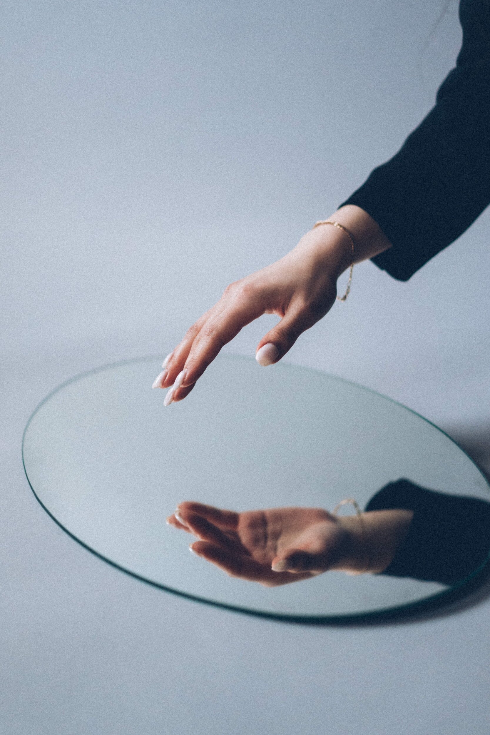
NOW LET'S TAKE A SEXY BREAK & LOOK AT THIS IMAGE
When you choose the right colors for your personal brand, select with INTENTION.
Perhaps Facebook wanted to be perceived as TRUSTWORTHY, but that doesn't apply in 2023 anymore, right? Please, always be careful about your brand's REPUTATION too.

HOW DO YOU CREATE A UNIQUE COLOR PALETTE FOR YOUR
VISUAL PERSONAL BRAND?
If you want to dive in this *serious business* alone, here's THE TEA:
1.
HOP ON THE WHEEL

So you don't want to create a STEW, right? OK, click the link below:
Colors that look good together are called HARMONIOUS. Designers use these principles to create a particular look or feel. You can use a color wheel to find color harmonies by using the rules of color combinations. Color combinations determine the relative positions of different colors to find colors that create a pleasing effect.
2.
HOW DO YOU SEE YOURSELF? vs PERCEPTION
Time to think about YOURSELF. Look into your closet, your home (and even your make-up kit). What DOMINANT COLORS do you see? What colors are you attracted to?
Make a list that contains max 5 colors.
Talk to your family, friends, colleagues and mentors. How would they describe you visually? Are you a Bright, Solar Person (optimistic, extroverted) or a Clam Ocean (dreamy, introverted).
You get the idea.
Now draw some conclusions.
What colors STAND OUT THE MOST?
3.
Think BUSINESS
What do you want to communicate, and what services do you sell? Are there any colors that align with your brand's values?

LET'S LOOK AT THIS:
Ema is a PARENTING & LIFE COACH. So naturally, her brand should simultaneously evoke a sense of professionalism, trustworthiness & playfulness.
Well, because people often saw her as having a calming demeanor and predominantly blue (in terms of colors), we chose a SOFT color palette that would match her personality & profession.
As a parent, you are more inclined to take parenting advice from someone who seems grounded and calming rather than one who wears all sorts of colors and bold outfits (this might be a BIAS, but unfortunately - it's true).
NOW LET'S DISCOVER SOME HELPFUL TOOLS

Palette Maker
an AI inclusive palette generator tool

Color Meanings
A fun website if you're curious about the meaning of colors

Coolors
extract a color palette from an image, color picker, contrast checker - a bunch of in-depth tools

Color Wheel
Adobe's Color Wheel is handy when creating a color palette using the COLOR HARMONY Principles.

Color Trends
A niche-oriented web page meant to help you discover what color palettes are trending (take it with a grain of salt)
LET’S TAKE A LOOK AT SOME EXAMPLES
Nicoleta is a life coach that leads with EMOTION. Our choice for the primary color was RED because, based on our research, people often described her as driven, fierce & passionate about her purpose. Yellow & Beige were added to soften the contrasting colors & add a more positive touch to the overall feel.

Mirela is a business coach for creative industries & a concept store owner. Her style is refined, bold, clean, and elegant, so the chosen colors and the overall aesthetic reflect her personality (because we're talking about personal brands, right?). Typically a color palette should have at most six colors, but in this case, since the colors are monochromatic, this type of approach works.
THINGS TO REMEMBER

Colors are personal & contextual;
Don't choose a variety of colors. Pick a PRIMARY/CORE color and build upon that;
Always check the CONTRAST between colors. It's a bummer when someone can't read a text or your logo because the colors need more contrast and are hard to see;
If you want the SAFEST option, here it is: pick a saturated color (red, blue, yellow, green, purple, pink) and add black & white—simple, effective, and foolproof.
Steal some COLOR PALETTES
WARM TONED

RGB Color codes from left to right : #9F6310, #FEF1D1, #4B4D38, #E9B15D, #171711
FOR THE BOLD

RGB Color codes from left to right : #FFFFFF, #F6F1D1, #D0C3F1, #5603AD, #353535